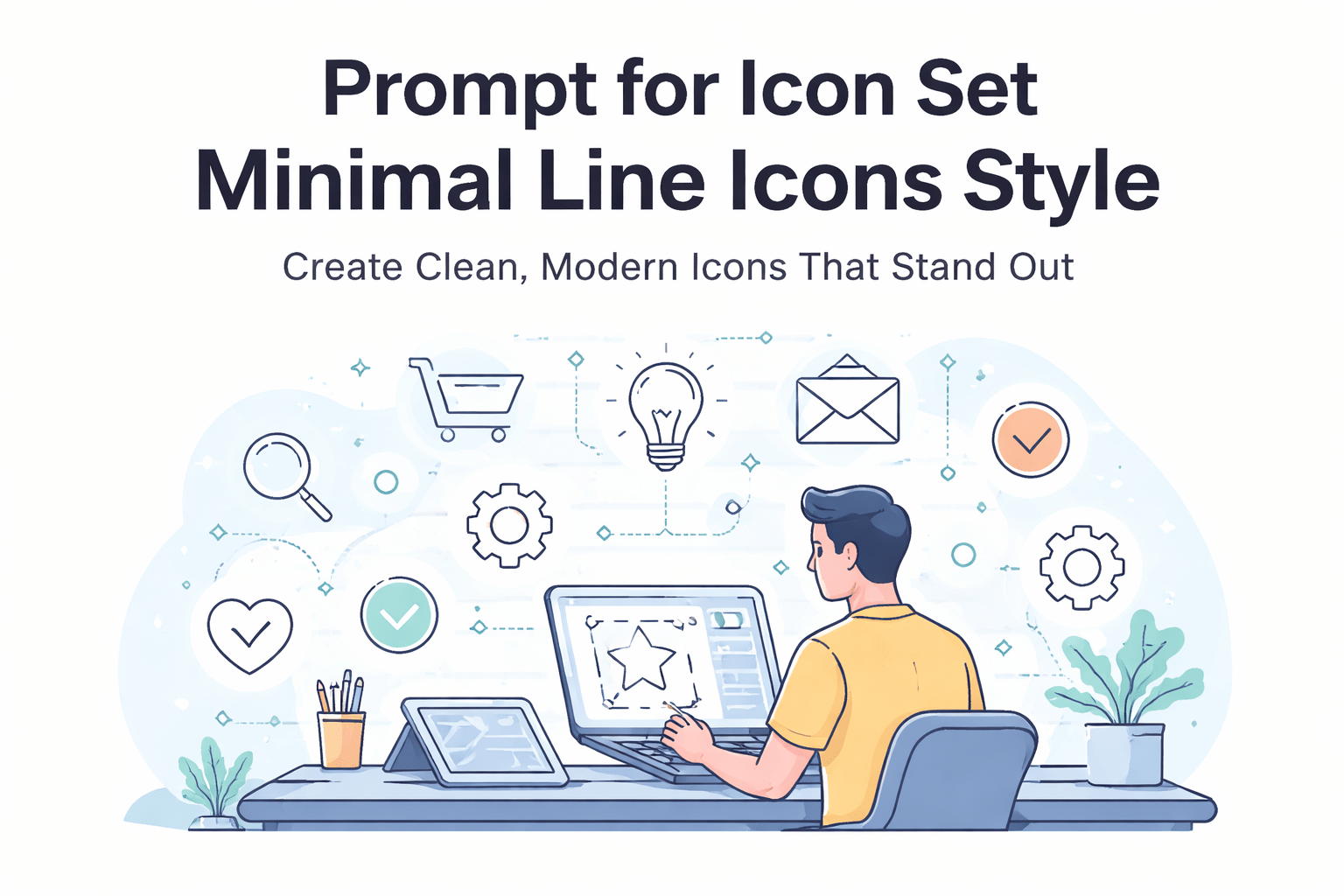
prompt for icon set minimal line icons style
Prompt for Icon Set Minimal Line Icons Style: Create Clean, Modern Icons That Stand Out
Why Simplicity Feels So Powerful
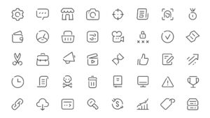
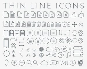
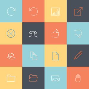
You’ve seen it everywhere—apps that feel smooth, modern, and instantly understandable. A big part of that experience comes from something small but powerful: icons. Not just any icons, but those clean, minimal line icons that quietly guide you without distraction.
If you’ve tried creating them, you already know the challenge. It’s not about adding more—it’s about removing everything unnecessary while keeping meaning intact. That’s where mastering the prompt for icon set minimal line icons style becomes your secret weapon.
When you know how to write the right prompt, you don’t just generate icons—you create a consistent visual language that elevates your entire product.
What Is a Prompt for Icon Set Minimal Line Icons Style?
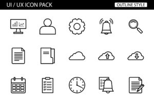
A prompt for icon set minimal line icons style is a carefully structured instruction you give to AI tools to generate a collection of icons with a clean, outline-based design.
Instead of random results, your prompt controls:
- The visual style (minimal, outline, geometric)
- The consistency (same stroke, same spacing)
- The output quality (vector-ready, scalable)
You’re essentially telling the AI:
“Give me icons that look like they belong together.”
Why This Style Dominates Modern UI
Minimal line icons are widely used because they:
- Load faster and scale perfectly
- Keep interfaces clean and distraction-free
- Improve user understanding instantly
That’s why you’ll find them in dashboards, mobile apps, SaaS tools, and even landing pages.
Core Elements of a High-Quality Icon Prompt
If your results feel inconsistent or messy, the problem is usually the prompt. A strong prompt follows a clear structure.
1. Define the Subject Clearly
Start by telling the AI what icons you need:
- Navigation icons
- E-commerce icons
- Social media icons
- Dashboard icons
Example:
“Icon set for mobile app navigation”
2. Specify the Style Keywords
This is where the magic happens. Use precise terms like:
- minimal line icons
- outline style
- clean vector
- monochrome
- flat design
3. Control Technical Details
To get professional results, include:
- consistent stroke width
- uniform spacing
- geometric shapes
- no gradients or shadows
4. Add Output Quality Instructions
Always guide the final result:
- vector style
- SVG format look
- high resolution
- UI-ready icons
Example of a Strong Prompt
“Minimal line icon set of 20 mobile app navigation icons, clean outline style, consistent thin stroke, geometric shapes, monochrome black, no shadows, vector style, UI ready”
Best Prompt Ideas for Different Use Cases
To help you get started faster, here are ready-to-use variations based on common needs.
UI and App Design Prompts
- Minimal line icon set for mobile UI, clean outline, consistent stroke, vector style
- Navigation icon set, minimal line style, modern UI, monochrome
Business and SaaS Prompts
- Minimal line icon set of business tools, clean vector outline, uniform stroke
- Dashboard icons, outline style, simple geometric shapes
Niche-Specific Prompts
- Health icons (heart, doctor, medical tools)
- Finance icons (wallet, chart, money)
- Education icons (book, graduation, learning)
Pro Tip
Instead of writing generic prompts, always:
- Add the number of icons (10, 20, 50)
- Specify the context (app, website, dashboard)
- Keep the style strict and simple
How to Maintain Consistency Across Icon Sets
Even with a great prompt, consistency is what separates amateur work from professional design.

Follow These Rules
- Use the same stroke thickness for every icon
- Keep proportions balanced
- Avoid mixing curved and sharp styles randomly
- Maintain equal spacing inside each icon
Use a Grid System
Most professional icon sets follow a grid like:
- 24×24 px
- 48×48 px
This ensures alignment and visual harmony.
Combine AI with Manual Editing
AI gets you 80% there. To reach the final 20%:
- Import icons into Figma or Illustrator
- Adjust spacing and stroke manually
- Fix inconsistencies
Prompt Ingredients Table for Better Results
| Element | Purpose | Example |
|---|---|---|
| Subject | Defines icon content | “shopping cart, user, settings” |
| Style | Controls visual appearance | “minimal line, outline” |
| Stroke | Ensures consistency | “thin uniform stroke” |
| Color | Keeps design clean | “monochrome black” |
| Output Quality | Improves usability | “vector, SVG style” |
Use this table as a checklist every time you create a new prompt.
Where You Can Use Minimal Line Icon Sets
Once you generate a solid icon set, you can reuse it across multiple platforms.
Mobile Applications
- Bottom navigation menus
- Settings pages
- Feature highlights
Websites and SaaS Platforms
- Dashboards
- Landing pages
- Feature sections
Branding and Marketing
- Social media posts
- Presentations
- Ads and banners
The more consistent your icons are, the more professional your brand looks.
SEO and UX Benefits of Minimal Line Icons
You might not think icons affect SEO—but they absolutely do.
Better User Experience
Clean icons help users:
- Navigate faster
- Understand features quickly
- Stay longer on your platform
Improved Engagement Metrics
When your UI feels intuitive:
- Bounce rates decrease
- Session duration increases
- Conversions improve
Search engines notice these signals and reward your content.
Pro Tips to Master the Prompt for Icon Set Minimal Line Icons Style
If you want next-level results, focus on refinement.
Be Specific, Not Generic
Avoid:
- “nice icons”
- “cool design”
Use:
- “minimal line icon set”
- “clean vector outline icons”
Iterate Your Prompts
Don’t settle for the first result. Try:
- Changing stroke thickness wording
- Adjusting number of icons
- Refining style keywords
Keep It Minimal
The biggest mistake is overcomplicating. Minimal design works because it removes noise.
Frequently Asked Questions
What is the best prompt for icon set minimal line icons style?
The best prompt includes subject, style, and technical constraints. For example:
“Minimal line icon set of UI elements, clean outline, consistent stroke, monochrome, vector style”
Can you use AI-generated icons commercially?
Yes, but always check the licensing terms of the tool you’re using.
Which tools are best for generating minimal icons?
Popular options include:
- MidJourney
- DALL·E
- Stable Diffusion
How many icons should be in one set?
A typical set includes:
- 10–20 icons for small projects
- 30–50 icons for full applications
Conclusion: Turn Simple Lines Into Powerful Design
Minimal line icons are more than just a trend—they’re the foundation of modern digital design. When you master the prompt for icon set minimal line icons style, you gain the ability to create clean, scalable visuals that instantly upgrade your app, website, or brand.
You don’t need to be a professional designer to start. You just need the right structure, the right keywords, and a bit of experimentation.
Now it’s your turn.
Start crafting your own prompts, generate your first icon set, and refine it until it looks like something you’d see in a top app.
Call to Action
If you’re serious about building a professional app or brand, don’t stop here. Take one of the prompts from this guide, test it today, and start building your own unique icon system. The faster you practice, the faster your designs will stand out. 🚀