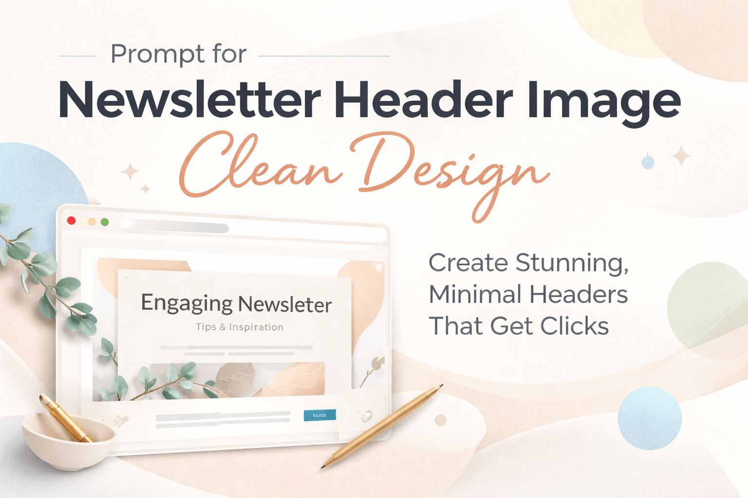
prompt for newsletter header image clean design
Prompt for Newsletter Header Image Clean Design: How You Create Stunning, Minimal Headers That Get Clicks
When you open your inbox, what makes you stop scrolling? It’s rarely just the subject line. More often, it’s the visual experience waiting inside. The moment your reader opens your email, your header image becomes the first silent message you send. If it looks cluttered or outdated, your content already feels less valuable. But when it’s clean, modern, and intentional, you instantly build trust.
That’s where mastering the prompt for newsletter header image clean design becomes your advantage. You’re not just generating images—you’re shaping perception, improving engagement, and positioning your brand as professional from the first glance.
Why a Clean Newsletter Header Design Matters More Than You Think
You might think the body of your email carries the weight. In reality, your header sets expectations before a single word is read.
A clean design does three powerful things:

- It reduces visual noise so your message feels easier to consume
- It signals professionalism and credibility
- It guides the reader’s focus toward your call-to-action
When your header is messy, your reader feels overwhelmed. When it’s clean, your reader feels guided.
Research in user experience shows that people process visuals faster than text. That means your header image influences whether someone keeps reading or exits within seconds.
What “Clean Design” Really Means in Newsletter Headers
Clean design isn’t about being empty or boring. It’s about clarity and intention.
When you aim for a clean newsletter header image, you focus on:
- Minimal elements instead of crowded visuals
- Balanced spacing that gives your content room to breathe
- Soft or neutral colors that don’t strain the eyes
- Clear focal points that guide attention
Think of it like a well-organized desk. Everything has its place, and nothing distracts from what matters.
How You Build the Perfect Prompt for Newsletter Header Image Clean Design
If you’re using AI tools, your results depend entirely on how you write your prompt. A vague instruction gives you generic output. A structured prompt gives you professional results.
Here’s a simple formula you can follow:
Style + Subject + Color Palette + Lighting + Composition + Quality
When you combine these elements clearly, you guide the AI instead of leaving it guessing.
Example prompts you can use right away
- Clean minimalist newsletter header, white background, soft shadows, modern layout, lots of white space, high resolution
- Minimal email header design, pastel colors, abstract shapes, balanced composition, professional clean style
- Modern newsletter header, neutral tones, simple geometric elements, soft lighting, high quality
Notice how each prompt includes visual direction, mood, and structure. That’s what makes the difference.
Key Elements You Should Always Include in Your Prompt
To consistently get high-quality results, you need to include specific keywords that signal clean design.
Make sure your prompt includes:

- Minimalist or clean style
- White space or balanced layout
- Soft lighting or natural light
- Neutral or pastel color palette
- High resolution or professional quality
These keywords act like instructions that shape the final image.
Choosing the Right Style Based on Your Newsletter Type
Not all newsletters look the same, and your header shouldn’t either. The best prompt for newsletter header image clean design adapts to your niche.
Business newsletters
Use prompts that emphasize professionalism and clarity
Example: clean corporate header, blue and white palette, abstract shapes, modern layout
Lifestyle newsletters
Focus on softness and warmth
Example: minimalist lifestyle header, pastel tones, cozy aesthetic, natural light
Tech newsletters
Lean toward futuristic minimalism
Example: clean tech header, dark background, neon accents, sleek UI style
E-commerce newsletters
Highlight products without clutter
Example: clean product header, white background, soft shadows, minimal layout
When your design matches your audience, your message feels more relevant.
Common Mistakes That Ruin Clean Newsletter Headers
Even with good intentions, it’s easy to fall into traps that destroy the clean aesthetic.
One of the biggest mistakes is adding too many elements. You might think more visuals make your design richer, but they actually make it harder to understand.
Another mistake is ignoring white space. Empty space isn’t wasted space—it’s what makes your content readable.
Poor color choices can also break your design. Bright, clashing colors distract instead of guiding attention.
And finally, weak prompts lead to weak results. If your instructions are vague, your image will be too.
How You Optimize Your Header Image for Email Performance
Creating a beautiful header is only part of the process. You also need to make sure it performs well inside an email.
Start by choosing the right size. Most email templates work best with a width between 600 and 1200 pixels. This ensures your image looks sharp on both desktop and mobile.
Next, compress your image so it loads quickly. A slow-loading header can cause readers to lose interest before they even see it.
Then, leave space for text overlay. Your header should support your message, not compete with it.
Finally, test how your header looks on different devices. What looks perfect on your screen might not translate the same way in an inbox.
Advanced Tips to Make Your Clean Header Stand Out
Once you master the basics, you can elevate your design with subtle enhancements.
You can use soft gradients to add depth without clutter. A gentle transition between colors makes your header feel more dynamic while staying clean.
Micro-details like light shadows or textures can also add sophistication. The key is to keep them subtle so they don’t overpower the design.
You should also think about visual hierarchy. Your design should naturally guide the viewer’s eye from the top to the main message.
When everything flows smoothly, your header doesn’t just look good—it communicates effectively.
Tools You Can Use to Generate Clean Newsletter Headers
You don’t need advanced design skills to create professional headers anymore. AI tools make it accessible.
Popular options include:
- Midjourney for highly artistic and detailed visuals
- DALL·E for flexible prompt-based generation
- Canva AI for easy editing and resizing
- Adobe Firefly for polished, brand-ready designs
Each tool has its strengths, but your results always depend on how well you write your prompt.
How You Turn a Good Prompt Into a Consistent Brand Asset
One great header isn’t enough. You need consistency across your newsletters.
Start by defining a visual style for your brand. Choose colors, spacing, and overall tone that reflect your identity.
Then, reuse and refine your prompts. Instead of starting from scratch every time, build on what already works.
Over time, your audience will recognize your style instantly. That familiarity builds trust and keeps people engaged.
Final Thoughts: Your Header Is Your First Impression
When you master the prompt for newsletter header image clean design, you gain more than just better visuals. You gain control over how your audience experiences your content from the very first second.
A clean header doesn’t shout. It doesn’t overwhelm. It quietly tells your reader that what follows is worth their time.
Now it’s your turn to put this into action. Start experimenting with your prompts, test different styles, and refine your approach until your headers feel effortless and professional.
If you want to take your newsletters to the next level, don’t stop at one design. Create a full set of clean, branded headers that make every email feel like a premium experience. Your audience will notice, and more importantly, they’ll keep coming back.