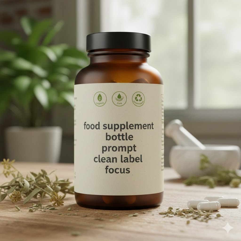
Food supplement bottle prompt clean label focus
The Ultimate Food Supplement Bottle Prompt: Why Clean Label Focus is Your Brand’s New Superpower
Imagine you are standing in a brightly lit pharmacy aisle. Your eyes scan dozens of plastic containers, all shouting for your attention with neon colors and aggressive “PRO-STRENGTH” claims. Then, you see it: a single, elegant amber glass bottle. The label is white, the text is crisp, and the ingredient list is shorter than your grocery list. You breathe a sigh of relief. You’ve found a brand that speaks your language.
This isn’t just a shopping trip; it’s a shift in consciousness. When you look for a food supplement bottle prompt clean label focus, you aren’t just looking for a design—you are looking for a way to communicate integrity in a crowded market. Today, we are diving deep into how you can bridge the gap between high-tech formulation and the “back-to-basics” transparency your customers crave.
The Rise of the Conscious Consumer: Why Transparency Matters Now
For years, the supplement industry operated in a “black box.” You’d see a proprietary blend on the back of a bottle and simply hope for the best. Those days are over. You are now catering to a “label reader”—someone who scrutinizes every milligram of maltodextrin and magnesium stearate.
The “Clean Label” movement isn’t just a marketing buzzword; it’s a commitment to removing the “noise” from health products. When you focus on a clean label, you are telling your customer: “I respect your body enough to give it only what it needs.”
Key Drivers of Clean Label Demand:
Safety Concerns: A desire to avoid synthetic dyes (like Red 40) or titanium dioxide.
Dietary Restrictions: The surge in vegan, gluten-free, and keto lifestyles.
Environmental Impact: Consumers want to know that the bottle itself isn’t harming the planet while the contents help their health.
Crafting the Perfect Visual: The Food Supplement Bottle Prompt
If you are using AI tools or working with a design agency, your “prompt” is the blueprint for your brand’s soul. A food supplement bottle prompt clean label focus needs to balance clinical authority with organic warmth.
Technical Elements of a Successful Design Prompt
When you are generating your brand visuals, you need to be specific about the “handshake” between the product and the viewer. Use these parameters:
The Vessel: Specify materials. Think “frosted glass,” “matte-finish PCR (Post-Consumer Recycled) plastic,” or “compostable pouches.”
The Palette: Avoid “sale” colors. Stick to sage greens, slate blues, or “pharmaceutical white” to evoke purity.
The Typography: Use high-contrast, sans-serif fonts. If the font is hard to read, the consumer assumes you are hiding something.
The Lighting: Soft, natural morning light. This creates a “wellness” vibe rather than a “factory” vibe.
Pro Tip: When writing a prompt for a designer, don’t just say “modern.” Say “Scandinavian minimalism with a focus on tactile luxury.” It changes the entire output.
The Architecture of a Clean Formula
What good is a beautiful bottle if the contents are full of “junk” fillers? To truly embody a clean label focus, your formulation must match your aesthetic. You want to swap out industrial shortcuts for functional, plant-derived alternatives.
Clean vs. Conventional: The Ingredient Swap
| Function | Conventional (Avoid) | Clean Label Alternative (Choose) |
| Flow Agent | Magnesium Stearate | Organic Rice Concentrate |
| Coloring | FD&C Yellow No. 5 | Turmeric or Beet Root Powder |
| Capsule | Gelatin (Bovine/Porcine) | Pullulan (Fermented Tapioca) |
| Sweetener | Sucralose / Aspartame | Monk Fruit or Thaumatin |
By choosing the right-hand column, you give yourself the “right to win” in the premium health space. You aren’t just selling a vitamin; you’re selling a cleaner lifestyle.
How to Layout Your Bottle for Maximum Trust
You only have about three seconds to capture a customer’s trust. Your bottle’s layout should act as a roadmap to their health.
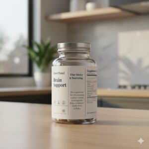
The Front Panel: The Hook
Your primary keyword—the benefit—should be front and center. If it’s “Brain Support,” don’t bury it. Underneath, use three clear icons: Non-GMO, Third-Party Tested, and Carbon Neutral. These are the “trust signals” that prevent the customer from putting the bottle back on the shelf.
The Side Panel: The Story
This is where you connect. Use your “Second Person” voice here. “We created this for you because we were tired of the fillers, too.” Explain your sourcing. If your Ashwagandha comes from a specific organic farm in India, say so. Transparency is the ultimate differentiator.
The Supplement Facts: The Proof
Don’t use “proprietary blends.” List every ingredient and its exact dosage. When you hide amounts, you lose the “Clean Label” argument instantly.
Implementing the Clean Aesthetic: A Practical “Recipe”
Let’s look at how you might describe a clean-label powder supplement in your marketing or on your packaging. Below is an example of a “Golden Milk” recovery blend that hits all the clean-label marks.
Clean Recovery Blend Ingredients
| Ingredient | Source | Benefit |
| Organic Turmeric | Curcuma Longa Root | Anti-inflammatory Support |
| Black Pepper Extract | 95% Piperine | Enhances Absorption |
| Organic Ginger | Rhizome Extract | Digestive Comfort |
| Coconut Milk Powder | Fresh Coconuts | Healthy Fats for Bioavailability |
This table demonstrates to your user exactly what they are getting and why—no “Natural Flavors” (which can be a catch-all for chemicals) allowed.
SEO and the “Clean Label” Niche
If you are writing content for your website, you need to understand that your audience is searching for specific solutions. They aren’t just typing “vitamins.” They are typing “best fillers-free multivitamin” or “sustainable supplement packaging.”
By centering your content around a food supplement bottle prompt clean label focus, you are capturing “High Intent” traffic. These are people ready to switch brands because they’ve finally become fed up with the status quo.
Content Strategy Tips:
Answer the “Why”: Write blog posts explaining why you chose rice hulls over chemical flow agents.
Show the Lab: Post videos of your third-party testing results.
User-Generated Content: Encourage your customers to take photos of your bottle in their kitchen. A clean, beautiful bottle is “Instagrammable,” which provides free marketing for you.
FAQ: Navigating the Food Supplement Bottle Prompt Clean Label Focus
What makes a supplement label “Clean”?
Essentially, it’s about simplicity and honesty. A clean label features ingredients you can pronounce, avoids synthetic additives, and is transparent about where those ingredients come from.
How can I improve my food supplement bottle prompt for better AI-generated labels?
Be ultra-specific about the “vibe.” Instead of saying “healthy,” try “holistic, apothecary-style, clinical yet approachable.” Mention the texture of the paper—”uncoated, recycled cream paper”—to get a more realistic result.
Does a clean label mean the product is organic?
Not necessarily, but they often go hand-in-hand. You can have a clean label with non-organic ingredients as long as they are minimally processed and free from “nasties.” However, organic certification is a powerful “Clean Label” badge.
Why should I avoid proprietary blends?
Proprietary blends allow companies to hide the exact amount of each ingredient. From a clean label perspective, this is a lack of transparency. Your customers want to know exactly how much of an active ingredient they are consuming.
Your Next Step in Brand Evolution
Transitioning to a clean label focus isn’t just a design choice—it’s a business philosophy. When you align your food supplement bottle prompt clean label focus with actual, high-quality ingredients, you create a brand that doesn’t just sell, but lasts.
The market is moving toward those who have nothing to hide. Are you ready to be one of them?
Would you like me to help you draft a specific “Back Label” story or a series of AI prompts to bring your clean-label supplement to life?