prompt for linkedin banner design minimal modern
Prompt for LinkedIn Banner Design Minimal Modern: Create a Clean, High-Impact Profile That Converts
Your Banner Speaks Before You Do
You land on a profile, and within seconds, you already know if the person feels credible, creative, or forgettable. That instant judgment often comes from one element you might be overlooking—your banner.
On LinkedIn, your banner is more than decoration. It’s your silent introduction, your positioning statement, and your chance to stand out in a sea of sameness.
If your current banner looks generic or cluttered, you’re missing an opportunity. In this guide, you’ll learn how to craft a powerful prompt for LinkedIn banner design minimal modern, understand why minimalism works, and create a banner that reflects your value clearly and confidently.
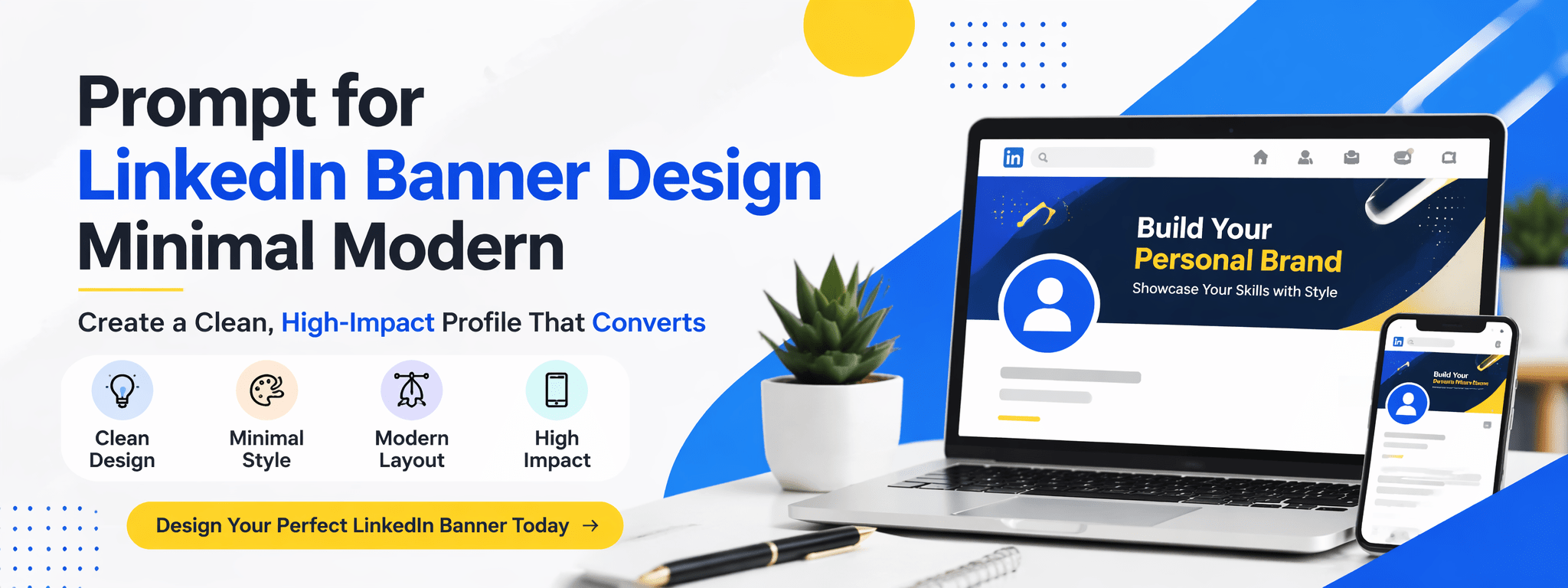
What Is a Minimal Modern LinkedIn Banner Design?
A minimal modern banner focuses on clarity, simplicity, and intentional design. Instead of overwhelming the viewer, it guides attention.
Key characteristics you should aim for
- Clean layout with strong spacing
- Limited color palette (usually 2–3 colors)
- Simple, readable typography
- Subtle visual elements instead of heavy graphics
Minimal design doesn’t mean boring. It means every element has a purpose.
Why minimalism works for your profile
When someone visits your profile, they’re scanning quickly. A clean banner helps them:
- Understand what you do instantly
- Feel a sense of professionalism
- Trust your personal brand
Clutter creates confusion. Simplicity creates clarity.
Why Your LinkedIn Banner Is a Strategic Asset
You might think your experience section matters most, but your banner sets the tone before anyone reads a word.
First impressions happen fast
Studies show people form opinions in seconds. Your banner can either:
- Reinforce your expertise
- Or make your profile look unfinished
Your banner supports your personal brand
Think of your banner as your visual headline. It can communicate:
- Your role (developer, designer, marketer)
- Your niche (AI, mobile apps, business growth)
- Your value proposition
It influences real opportunities
A strong banner can lead to:
- More profile clicks
- Better connection requests
- Increased inbound messages
The Best Prompt for LinkedIn Banner Design Minimal Modern
If you’re using AI tools, your result depends entirely on your prompt. A vague prompt gives generic results. A clear prompt creates something powerful.
Use this high-quality prompt
Create a minimal modern LinkedIn banner with a clean layout, soft neutral colors, and professional typography. Include subtle abstract shapes, balanced spacing, and a clear focal point. Style should be elegant, futuristic, and uncluttered. Focus on personal branding with a calm and premium aesthetic. Avoid excessive elements and ensure high readability.
How to customize your prompt for better results
You should always tailor the prompt to your identity:
- Add your profession: “Android developer”, “UI designer”
- Define your tone: “corporate”, “creative”, “tech-focused”
- Specify colors: “dark mode with blue accents”
- Include a message: “Building high-performance mobile apps”
The more specific you are, the more unique your banner becomes.
Essential Elements of a Minimal Modern Banner
To make your banner effective, you need to understand the building blocks behind great design.
Typography that feels clean and confident
Your text should be:
- Short and impactful
- Easy to read on both desktop and mobile
- Using modern fonts like sans-serif styles
Avoid long sentences. Think headline, not paragraph.
Color palette that supports your message
Minimal modern design usually uses:
- Neutral base (white, black, gray)
- One accent color (blue, purple, or green)
Consistency matters more than creativity here.
Layout that respects space
Your layout should guide the eye naturally:
- Keep key text away from the left side (profile photo overlaps)
- Use spacing to separate elements
- Avoid crowding the design
Visual elements that add, not distract
You can include:
- Light gradients
- Abstract shapes
- Subtle patterns
But keep them soft and secondary to your message.
Recommended Banner Size and Technical Specs
Before designing, make sure your banner fits perfectly.
LinkedIn banner specifications
- Size: 1584 x 396 pixels
- Format: PNG or JPG
- Maximum size: 8MB
Safe area tips
- Keep important content centered or slightly right
- Avoid placing text behind your profile picture
A perfectly designed banner can still fail if it’s poorly positioned.
Step-by-Step Process to Create Your Banner
You don’t need to be a professional designer to create something impressive. You just need a clear process.
Step 1: Define your message
Ask yourself:
What should someone understand about you in 3 seconds?
Step 2: Choose your style direction
Decide the feeling you want:
- Clean corporate
- Creative minimal
- Futuristic tech
Step 3: Use design tools
Platforms like Canva or Adobe Photoshop make this process simple, even if you’re just starting.
Step 4: Apply your prompt
Paste your customized prompt into your AI tool and generate variations.
Step 5: Refine manually
Adjust spacing, alignment, and text placement to match LinkedIn’s layout.
Step 6: Export and test
Upload your banner and check how it looks on:
- Desktop
- Mobile
Small adjustments can make a big difference.
Common Mistakes That Ruin Your Banner
Even a good idea can fail with poor execution. Avoid these mistakes.
Overloading your design
Too much text or too many elements create confusion.
Ignoring readability
If people can’t read your message quickly, they’ll skip it.
Using inconsistent branding
Your banner should match your profile tone, colors, and industry.
Copying generic designs
Templates are fine, but your banner should still feel personal.
Advanced Tips to Make Your Banner Stand Out
Once you’ve mastered the basics, you can level up your design.
Add a clear value proposition
Tell people what you bring:
- “Helping startups scale with AI”
- “Building fast and modern mobile apps”
Use subtle branding
If you have a logo, keep it small and clean.
Think about positioning
Your banner should support your headline and profile picture, not compete with them.
Optimize for mobile first
Many users will see your profile on their phone. Keep text large and centered.
FAQ: Prompt for LinkedIn Banner Design Minimal Modern
What is the best prompt for LinkedIn banner design minimal modern?
A strong prompt focuses on simplicity, clarity, and professional aesthetics while avoiding clutter.
Can you create a banner without design experience?
Yes. Tools like Canva make it easy, especially when you use a structured prompt.
What colors work best for minimal modern banners?
Neutral tones combined with one accent color usually perform best.
How often should you update your banner?
Every few months or whenever your personal brand evolves.
Conclusion: Build a Banner That Works for You
Your banner isn’t just a background image. It’s your first impression, your positioning tool, and your silent pitch.
When you use the right prompt for LinkedIn banner design minimal modern, you turn a simple visual into a powerful branding asset. You make it easier for people to understand you, trust you, and connect with you.
Now it’s your move.
Take a few minutes, craft your prompt, create your banner, and upgrade your profile today. The difference might look small—but the impact can be huge.